
Appearance: Colored, Black & White and High legibility
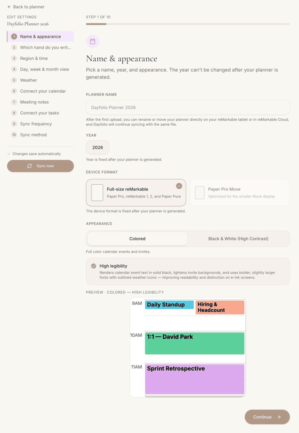
Step 1 — Name & appearance holds the choices that most change how the planner looks on your screen. All of them can be changed later and take effect on the next sync.
Colored
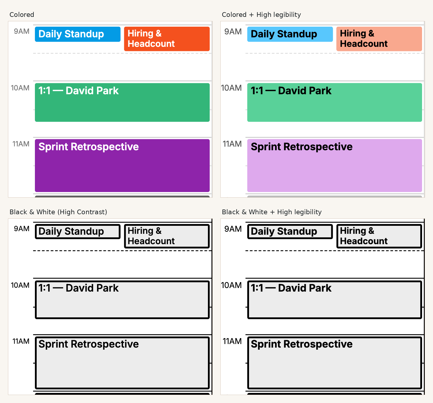
The default. Calendar events and invites are drawn in the colors of their calendars, each month has its own accent color on the tabs and headers, and the weather icons are filled. Made for the Paper Pro and the Paper Pro Move.
Black & White (High Contrast)
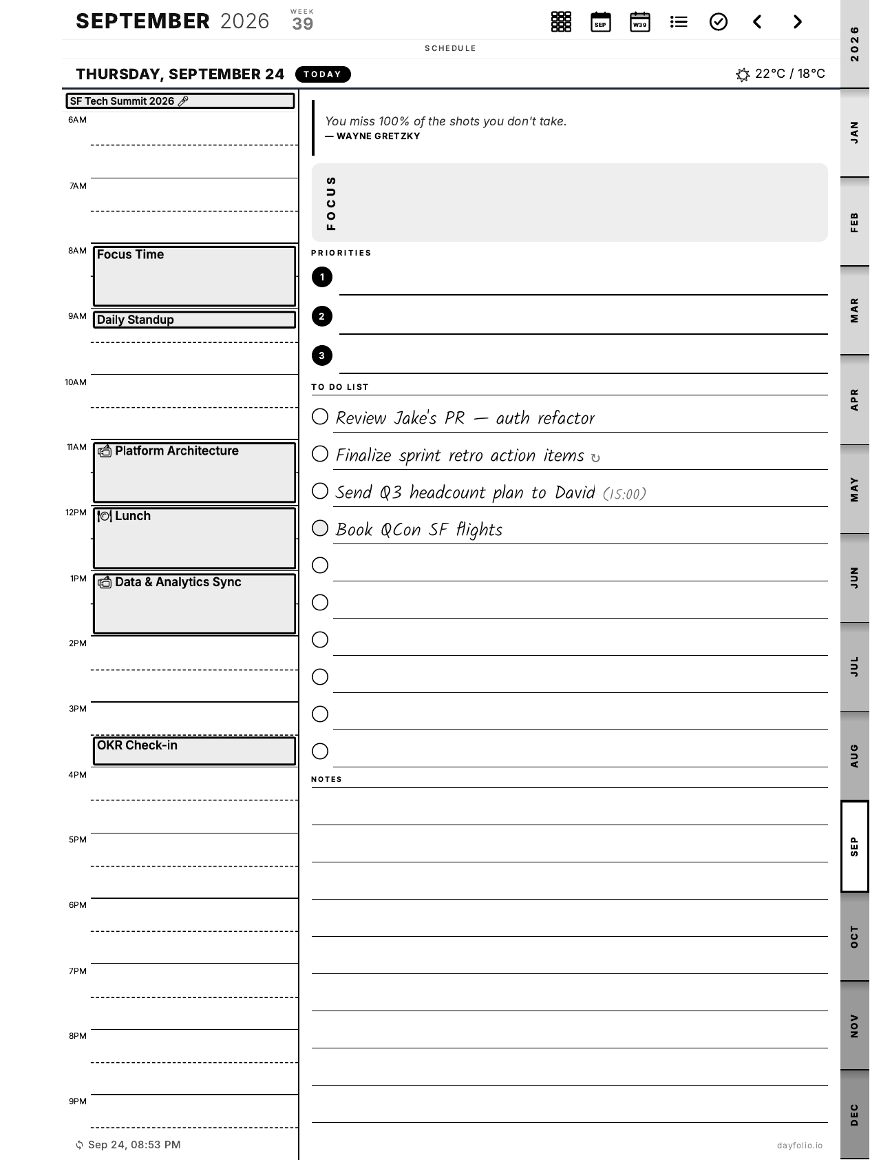
A monochrome version of the same layout with stronger strokes and darker text: events become solid blocks, dividers, checkboxes and month tabs are drawn in full black. It exists for the reMarkable 2, reMarkable 1 and Paper Pure, whose screens have no color.
High legibility
An option that works with either mode. When it's on, Dayfolio:
renders calendar event text in solid black instead of a color derived from the event;
lightens the background of invites so the black text stands out;
uses bolder, slightly larger fonts for event titles;
draws the weather icons as outlines.
It's recommended on every device and especially on black-and-white screens. The trade-off is that very busy days look a little denser.
Event colors and contrast
Independently of these settings, Dayfolio adjusts the text color of every event to keep it readable on its background — a very light calendar color gets dark text automatically. Where the colors come from and how to change them per calendar is covered in Calendar colors and hiding events.
Combine with the reMarkable's own contrast setting
The Paper Pro and Paper Pro Move have an Increase contrast option in the ⋮ menu (three dots) of an open document; on other models, check whether yours offers it. It's set to Adaptive by default; choose Full page for the strongest contrast, which makes colored blocks read as solid. It stacks well with Black & White + High legibility, which is a setting of each planner in Step 1. See Better contrast on black & white devices.
Preview before you sync
Below the appearance options, Step 1 shows a preview of a Day View with the current choice, so you can compare Colored, Black & White and High legibility before regenerating.