
Better contrast on black & white devices
Dayfolio's default look is designed for the Paper Pro's color screen. On a reMarkable 2, Paper Pure or reMarkable 1, colors become shades of gray, and a few settings make the page as crisp as a printed one.
In Dayfolio (Step 1 — Name & appearance)
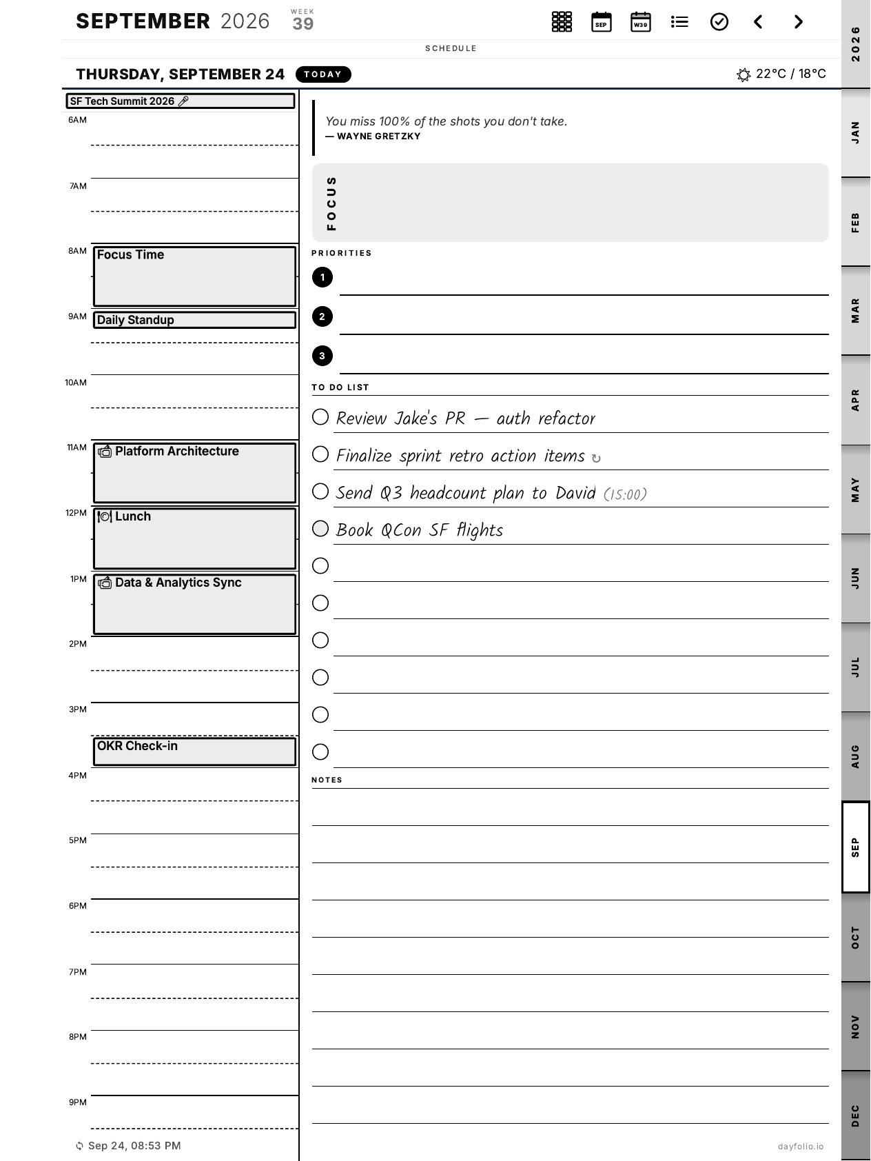
Choose Black & White (High Contrast): events become solid blocks, dividers, checkboxes and month tabs are drawn in full black.
Turn on High legibility: event text in solid black, lighter invite backgrounds, bolder titles, outlined weather icons.
Press Sync now.
Below the appearance options, Step 1 shows a preview of the result before you regenerate. Details in Appearance.
On the reMarkable
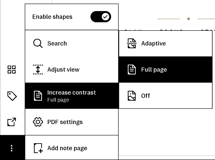
The Paper Pro and Paper Pro Move have an Increase contrast option in the ⋮ menu (three dots) of an open document, with three settings: Adaptive (the default), Full page and Off. For the crispest planner, open it and choose ⋮ → Increase contrast → Full page: grays are then rendered as solid blacks, which makes event blocks and pills stand out.
On other models, check whether yours offers the option; if it doesn't, the two Dayfolio settings above do the job on their own.
Text size
If titles are still small, set Calendar event text size to Large in Step 4 — see Day, Week & Month View settings.
On a color device
The same two Dayfolio settings work on a Paper Pro or Move if you prefer a monochrome, high-contrast page, or if you find a busy day with many pastel events hard to scan.